Camo photographing different than in person?

Joined
Oct 6, 2020
Messages
306
Location
El Dorado County, CA
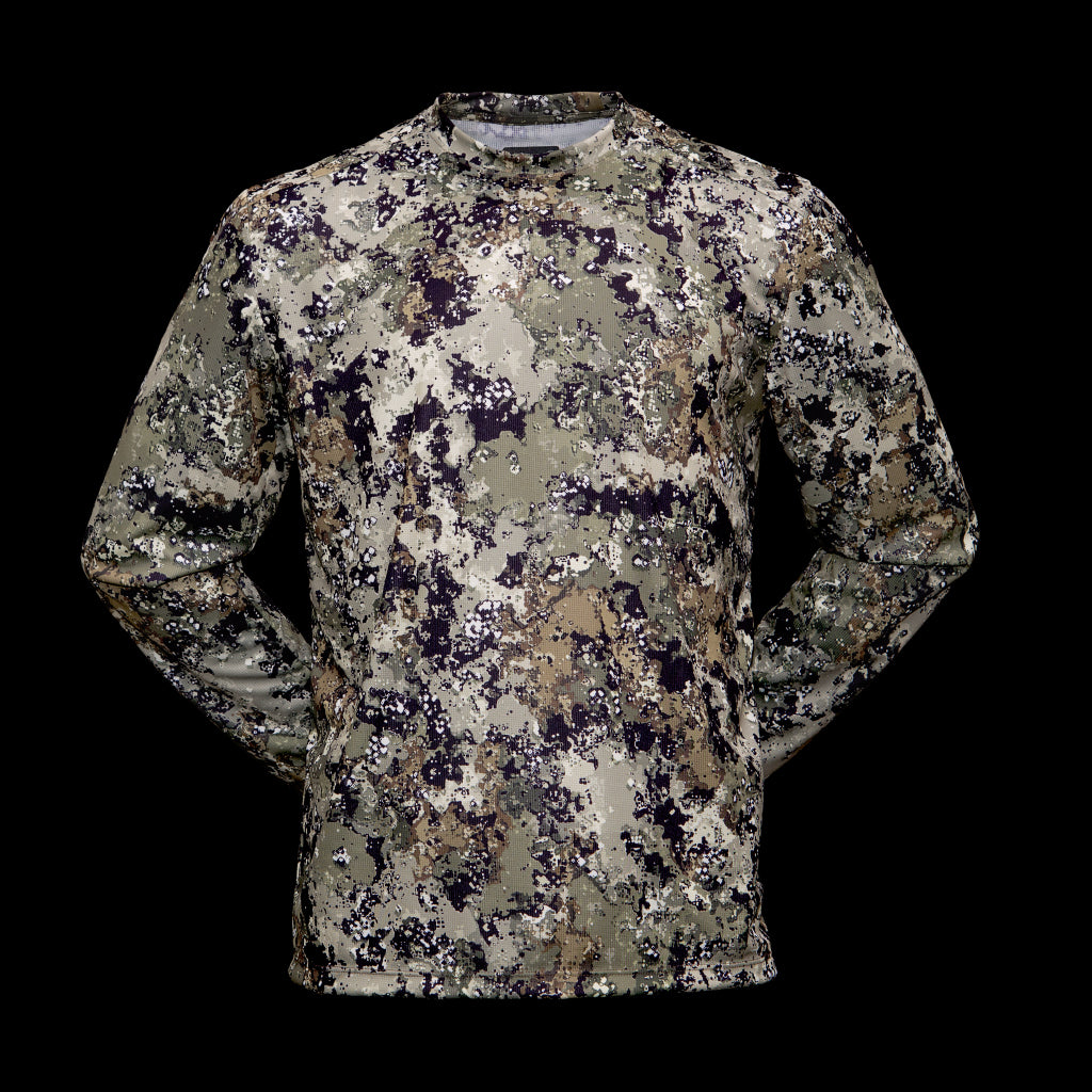
I was looking for made in USA camo and came across Gulch Gear so I decided to try their Axle pattern. I primarily hunt the western slope of the Sierras in northern California and Axle looked like a good fit for the area. When I opened up the package the first thought was "whoa, that's very green". I showed it to my wife and kids asking what color it is, they all said green and I'm not colorblind or have eye issues.

But when I took some pictures in the sun and shade, I'll be damned it looked exactly like the photos online. I've never experienced that before and the Kuiu Verde 2.0 or Realtree AP I have on hand looked the same in person as in camera. I doctored up a photo to try and show how it looks for me (and yes it looks that drastic to my eye). Has anyone else encountered this?

BTW the piece itself is really nice and should be great for our warm weather deer season. Going to be 90 tomorrow, 10/14 :rolleyes:

Photos:

Online: Gulch Gear Lightweight - Axle

Gulch_CCAxle_LSShirt_1024x1024.jpg

Gulch_CrossCoverAxle02.jpg


Out of the camera - bright sun:
P1090440.jpg

Out of the camera - shade :
P1090444.jpg

Edited:
P1090444 - green.jpg
 
Last edited:
Joined
Nov 5, 2015
Messages
651
Don’t overthink it. What matters is what the game animal sees and green really won’t matter to them.


Sent from my iPad using Tapatalk
 

btindall

FNG
Joined
Mar 7, 2017
Messages
29
Location
Hillsboro, Oregon
But when I took some pictures in the sun and shade, I'll be damned it looked exactly like the photos online.
Hi HJ,

While working at Pixar I learned a lot about how color and light affect space, and applied that same concept to designing our camouflage color palette. Pixar had a unique story telling approach using positive and negative space, along with the influence of light, to help direct your eye around the screen without taking you out of the story. If we take a look at how lighting works, it is made up of light photons that bounce around in an environment. This is called Radiosity in the computer. When a light photon hits an object, it bounces off, taking some of the color from that object along with it. The next object that photon hits will deposit that new color onto it. This happens every time it bounces until the photon completely decays. Think about it as wearing a red shirt and leaning up against a white wall. You will see a pink hue on the wall around the shirt because of the light photons bouncing off the red color and depositing it onto the white wall. Red and white mixed together make pink. The color palette on Gulch's patterns are designed to take advantage of an environment's Radiosity, and will change colors as you move between different environments. In a dominantly red environment, the reflective photons would affect the color green and change it to a ranger green or a brownish green. Red and green make brown. The green color in our camouflage pattern is designed to be a yellowish green hue to take full advantage of the color shift created by the photons bouncing around it.
When designing our camouflage patterns, the influence of light and how that light affects color was the most important part of our design process. Since our colors are designed for photons coming from the natural sunlight they will look, or could look very different under indoors lighting conditions.

Cheers,
Brian
Owner, Gulch LLC
 
Last edited:
OP
H
Joined
Oct 6, 2020
Messages
306
Location
El Dorado County, CA
Don’t overthink it. What matters is what the game animal sees and green really won’t matter to them.


Sent from my iPad using Tapatalk
I'm not, just seeing if it was my eyes playing tricks on me or if others have observed the same thing with different brands.

Hi HJ,

While working at Pixar I learned a lot about how color and light affect space, and applied that same concept to designing our camouflage color palette. Pixar had a unique story telling approach using positive and negative space, along with the influence of light, to help direct your eye around the screen without taking you out of the story. If we take a look at how lighting works, it is made up of light photons that bounce around in an environment. This is called Radiosity in the computer. When a light photon hits an object, it bounces off, taking some of the color from that object along with it. The next object that photon hits will deposit that new color onto it. This happens every time it bounces until the photon completely decays. Think about it as wearing a red shirt and leaning up against a white wall. You will see a pink hue on the wall around the shirt because of the light photons bouncing off the red color and depositing it onto the white wall. Red and white mixed together make pink. The color palette on Gulch's patterns are designed to take advantage of an environment's Radiosity, and will change colors as you move between different environments. In a dominantly red environment, the reflective photons would affect the color green and change it to a ranger green or a brownish green. Red and green make brown. The green color in our camouflage pattern is designed to be a yellowish green hue to take full advantage of the color shift created by the photons bouncing around it.
When designing our camouflage patterns, the influence of light and how that light affects color was the most important part of our design process. Since our colors are designed for photons coming from the natural sunlight they will look, or could look very different under indoors lighting conditions.

Cheers,
Brian
Owner, Gulch LLC
Thanks Brian for the reply. If the Axle looks more yellowish-green in person (under "normal" conditions), what about your other patterns like Cross Cover Brown or Gray?
 

btindall

FNG
Joined
Mar 7, 2017
Messages
29
Location
Hillsboro, Oregon
I'm not, just seeing if it was my eyes playing tricks on me or if others have observed the same thing with different brands.


Thanks Brian for the reply. If the Axle looks more yellowish-green in person (under "normal" conditions), what about your other patterns like Cross Cover Brown or Gray?
Our CCBrown pattern has a very warm tone color palette and is more stable under POS (Point of Sales) lighting and home lighting. The CCGray is made up of more neutral grays, but still on the warm side and absorbs green/blue light very well, which will reflect back more of a cool gray tone palette under POS lighting. Both patterns are designed under daylight or 5400k lighting and have a nice balance point that will take advantage of both the light and environments colors during different times of the day.

cheers,

Brian
 
Top