
You might have noticed a few less posts on the Rok Blog this spring. Besides launching Boot Month, Backpack Month, Camp Month, and Weapons Month, I was also completing a dream of 25 years – writing a book on hunting big mule deer.
I was in my early twenties when I decided that some day and Lord willin’, I’d love to write a mule deer book. I kept journals since the early ’90s of nearly everyday I spent in mule deer country, whether it be scouting or hunting. This last December I was contacted by an editor, Kelly Andersson, who said she’d love to work with me on publishing a book of my adventures that could also help others become a better mule deer hunter. She didn’t have to ask me twice! I hit the keyboard in late December and finally clicked the “send” button last week. The book is going to be available for purchase in the next few months.
While I’ve published dozens of articles and nearly a hundred blog posts on mule deer, this book is very different from anything I’ve done before. You see, in the world of magazines, the internet, and short attention spans, it’s very hard to teach people through anecdotes (stories that illustrate a point, concept, or principle) due to space and time constraints. I’m often forced to teach without a lot of background or example- just describe the technique, mention a hunt I applied it in, then wrap it up in under 1,000 words. Articles like that are great over a cup of coffee or while waiting in the dentist’s office but don’t really give the reader a true sense of reality. This book allowed me to do what I’ve always wanted to do – that is illustrate the “how-to” of hunting big mule deer through short stories. To me, it’s the most effective way to learn.
The book is far more than stories, though. Titled “Hunting Big Mule Deer: How to Take the Best Buck of Your Life” I go way beyond stories and show you exactly what I’ve done to find and kill dozens of big mule deer over the years. Hunting Big Mule Deer begins with my formative years learning to buck hunt from some very important mentors, including my father, and I include what these men taught me that can help you. I then examine the more recent history of mule deer hunting that is affecting today’s hunter. I round out the book with both the essential gear and the nine techniques every mule deer hunter should be using no matter if he’s hunting the high country, the desert, or the foothills. I thoroughly discuss what I’m doing today to both find areas that hold big mule deer and what I do to punch my tag once I’m there.
Hunting Big Mule Deer is a huge expansion of new material based partly on my Rok Blog series, “Killing Big Mule Deer.” If you’re new to the Rok Blog and want to catch up on all those posts, including several years of in-the-field Live Hunts, click on the Mule Deer category on the right side of this page.
At over 70,000 words (most how-to books are less than 50,000 words), Hunting Big Mule Deer promisies to be a resource you can use for years. I know that even as an experienced mule deer hunter, I can learn from anyone’s experiences in mule deer country, and you can too through this book. I wrote Hunting Big Mule Deer to both teach and entertain. With over 220 photos, including live photos by top mule deer photographer Rod Sinclair, you will “feel” like you’re there with me.
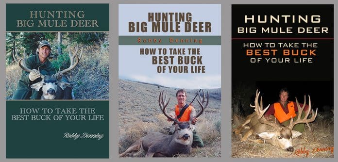
So here’s where I need your feedback. I submitted the edited manuscript back to Kelly Andersson on June 2nd. She’s now doing the final edit and artwork. She’s given me three example cover designs to choose from. Besides your feedback, this will be your chance to win one of three of the first copies due out in August. Most of you know the Rok Blog is a great place to learn and win, and this project will be no different.
Here are the rules:
From the sample covers shown, provide your feedback in the comment section below. I’d like to know which cover you like the most. You can also comment on fonts and color schemes that you think look the best. For you long-time subscribers who’ve also followed my Live Hunts, I’d especially like to hear from you as you know the “feel” of what it’s like to go in the field with me. If possible, I’d like to capture that feeling in the cover of the book.
Once the book publishes later this summer, I’ll draw three winners from the list of comments below. Make sure you’re a Rok Blog subscriber by clicking “Subscribe to blog” upper right under Fitness/Other and please use your first name and last name (or last name initial) when you comment. Since I’m not quite sure when we’ll draw for the winners, you should subscribe to this blog post by clicking “Subscribe to this entry” below the comment box.
You can comment as many times as you like, but we’ll only count one entry per person. For clarity, the book covers are numbered 1, 2, and 3 from left to right. For reference, you’ll notice the covers at the top of the blog have better resolution than these below. Depending on you browser, you might be able to click on the top covers and see a larger version. Thank you for your feedback.

#1 #2 #3

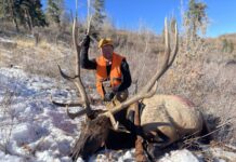




I am voting on #3 for a couple of reasons. Fantastic Buck and pic, plus in the title
it jumps out at you as to why needing this book is important.
Thanks Robby-looking forward to this !
Darin F.
#2
Can’t wait to read it!
Number 3 is my vote. I feel like it is cleaner and catches your attention more than the others. I can’t wait to get my hands on this book.
Hey Robby, I’m excited to hear about your book! I like the picture on cover #2, with the lettering and format of number 3. Another option you may want to consider for the cover, if these aren’t set in stone, is a big Idaho buck still on the hoof. Looking forward to the release in August! – Devin M.
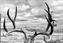
I like the 1st cover on the Left side…..I’m primarily a bow hunter, so I’m probably basing it on the picture not having any Blaze Orange in it. I do like the background of the middle picture, since my hunting grounds are the ND Badlands…..
Cover #3. It stands out with the black on white lettering, the deer in the picture is a mule deer hunters dream, and covers #1 and #2 have a somewhat “dated” look to me like they came out of the 80’s. The deer on cover 3 stands out boldly against the background, the deer on covers #1 and #2 both blend in with the background coloring too much. If I were looking at all 3 covers together at a retailer, I would automatically reach for #3. Im looking forward to reading it, congrats on the accomplishment!
Very Cool. I like #2.
#3
It just stands out to me from the choices. I can’t wait to read the book
Thanks for taking the time to help make us better mule deer hunters.
#3 for sure.Plus, the light type with a dark background help the title and subtext stand out better.
I like #2 the best. It appears to me that is would pop out the most if it were in a bookstore or displayed. I like #1 for the fact that it is nostalgic looking. #3 the background seems to dark. Great pics for all 3 ideas though. Can’t wait to get a copy this August!
This is great feedback guys, keep it coming!
Man what a tough decision. I like #3 because of the color and contrast but dont like the forced perspective of the photo to make the deer look bigger. I like #2 because the photo feels more real, if that makes sense.
Congrats Robbie. Number 1
Robby, Congrats on your book! I’ve yet to focus in on Mule deer hunting, living most of my life east of the Mississippi most of my life. I hope to do that one day. Learning from mentors is the ideal format from my experience. It sounds like this book will include lessons learned from your dad, that’s great! In these days of “everyone’s an expert” it’s easy to get lost in all of the info. But when you have someone that has taken you under their wing and “shown” you the ropes: that’s where real learning and ownership can take place. For me that was my father-in-law who introduced me to the joys of hunting and the outdoors at age 18. He’s gone now but his legacy lives on and is now being passed down to my children.For my taste.s the #2 cover is most attractive. Mostly because of the scenery in the background 🙂 Thanks for passing along your experiences so that we all can learn from what you’ve been taught.
Jim D.
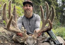
Congrats Robbie! I like #1 the best. Seems to fit your personality, writing style, and stories best.
I personally like #1 the best, although #3 is a close second.
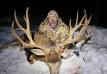
#3 for me on what stood out. Title shows up good and cool looking evening picture of you with that gnarly rack of of great big buck. That’s awesome news about the book. I enjoy reading all your blogs and articles Robby, although I don’t post much on them. Can’t seem to get auto log in to work on the RokBlog for some reason. I will on this post though hearing about your book. I’m really looking forward to seeing your book when it comes out and buying a copy.
#3. Don’t know too much about fonts but that massive buck really grabbed my eye. I would call that buck the definition of BMD.
I prefer cover #2. I find there is too much contrast with cover #3 and too little picture with cover #1.
I like both #2 and #3, however I think the edge goes to #3. I can’t wait to get my hands on a copy of this book. I’ve really been enjoying the mule deer threads you’ve been posting.
Number 3 is my favorite. The font looks clean with a little bit of a modern edge and the buck is awesome. Number 2 is a close second. Looking forward to this one, Robby!
I like the font of #3. The only thing about 3 I do not like is the blaze orange. Neon colors draw attention away from where they belong. The font and green in #1 is very noble and classy looking. Happy to hear about the book!
Tony Trietch
First, congratulations! Sounds like an awesome book and I will purchase one as soon as they are printed. I prefer cover #3
#1 has the cool, rustic factor. It probably applies to the core mule deer hunter the best.
#3 is a giant buck. And would probably sell more copies.
My vote is #3, super super tough choice.
Congratulations on your book, It has been a long time coming.
I prefer #1, but #3 really caught my eye first. If that big buck was on #1 it would be my first choice. I think you should go with #3
#3 for me. Looking forward to reading your book.
I like #3. The font is visually appealing and the picture is great. #1 has the feel of a classic hunting how to book and would be my second choice.
Looking forward to reading. Like the others I like the font of #3, although the nightime pic is not as appealing. Also like the old school look of #1. Whatever you choose, I hope that you get the book in quality paper & binding – I’d rather pay an extra 5 bucks for something that feels & looks good.
#3 is my choice.
It was close with #2 but I think you look more relaxed in #3. I like the font in #2/3 not #1. All the bucks are great. Looking forward to reading your book!
Congrats!
i think # 2 looks great!
there are some other books out there already that look like # 3.
blessings
I like #1 for the simple reason, that is what the majority of our hunts looked like as a kid, # 2.3 are cleaner… and flashier. Yet when I think of the old days ,high pine basins, canyons choked with aspens and miles of sage flats… that is how I remember the days of big buck hunting for the average hunter. Look forward to getting a copy.
Of those choices I like 3 the best, it is catchy, #1 is second choice. The picture that portrays your hunts the best is probably the one you have in the mule deer blog under the title Application Strategy:My Personal Strategy Part II (with the snow, army tent, and a huge muley). Next book you write you can add Jalepeno to it!! Looking forward to reading the book and following your hunts!
MT
I like number 1 but I would pick what was your favorite hunt out of those. This is your ride buddy, make it just how you like it. We follow you because of that! Cannot wait for the release date and Congrats!!
Well, I vote for number 3 for the front cover and the center photo for the back cover. Who says you can’t do both?
In any case, count me in for an autographed copy.
Randy
#3 for sure, the composition of the colors with the wording being correctly positioned “AKA uniformly” fitted across the cover.
It is a very clean and solid look. And the size of the buck just screams that you need to read this book to get in the game. AND you can watch that hunt on line! Win, win..
Good luck with the book.
I like #1 best. Although I am a rifle guy I like pictures that don’t have any blaze orange. I like the muted green colors and lettering that are easily read yet still match the color scheme. Cover 1 looks more authentic and less gimmicky than the other two. Although the buck in cover 3 is nice I’m not a fan of night pictures, I like to see the background. Cover 3 also looks too fancy like the content isn’t enough to sell the book so you had to try and dazzle with lettering that is not only big and colorful but also emphasizes key words. Cover 2 would be my second choice, there is landscape in the background and the lettering is more straight forward than cover 3. Although I think it would be better with your name in the lower right corner like the other two.
Cover 1 looks like a book. Covers 3 looks like a magazine.
My vote would go as so 3, 2, 1. #1 is a distant third…too boring and for some reason looks like something I’d get a the forest circus. #3 is the most eye catching with the black background and the big old nasty buck front and center. If I’d change anything I’d move your name to a more prominent place…maybe similar to #2.
Great news Robby! I will buy the book as soon as it is available. As far as cover picture, I think it is easily number 3. It really focuses on the big deer and hunter as a secondary focal point.
#2
Let us know when it is available… looking forward to reading it!
Robby, congratulations! They are all great bucks, but I like the cover/scenery in #2 the best. Even though #2 is the most visually appealing, the buck itself in #3 is just insane.
It was easy for me to choose #3. It seemed by far the “newest” modern looking. Clean and easy to read. The title just stands out.
I like 1 & 3. Can’t wait for the book. I hope you have it printed with quality binding & paper, I think most of us would be willing to pay extra for something that lasts and feels nice.
My vote is #2. I like 3, but it’s a little dark. Thank you for writing. No matter the draw, I will own this book!
Number 3 looks like Eastmans Mule deer book and the other one they sell on their site. #2 for me
Awesome Robby, can’t wait to read!!! Congrats
#3 has the visual pop and I think will have the greatest shelf appeal.
However #1 shows you are all business in the front and party in the back (mullet) so hopefully the pic will be in the book
Corey Dixon
“mullet” ha ha! It’s called too long in the backcountry! Thanks for the feedback
My vote is for cover #3. All the bucks are awesome, but the pose of the buck in #3 with it’s head turned just slightly to the left along with the black background and the flash from the camera make it pop out really well! Also in favor of #3 I like how some of the font is in orange, and also that it’s centered on the page. I think the font being centered looks better.
Looking forward to cracking it open!
#3, congrats on the book!
#3 can’t wait to read it!
I like #1. Hopefully it’s out before Sept.
I prefer #1 for the following reasons:
1) You look older. Older = more wisdom.
2) I like the font for your name.
3) No blaze-orange; can apply to any method of take.
4) Green seems more natural for this kind of book.
5) I like the block balance – it gives the impression of a window.
6) Your shirt/gloves blend in – eyes are naturally drawn to the subject (the deer) and then naturally to the face … and back to the lighter-colored deer. The two, photographically, keep your eye on the subject area where it should be. If anything, I’d almost photoshop DOWN the background about 1/3-1/6 of a stop. Just a touch, not noticeable but just enough to subtly reinforce the “keep your eyes on the subject area of me and my buck.”
I dislike #2 for the following reasons:
1) Love the open country, but with a rifle showing it feels more like a long-range shot. No offense meant here, but if I want to learn about and animal and hunt one, I’d rather learn from someone in a more challenging environment than “spotter from 3 miles out, walked up to a few hundred yards and shot him from there.” You probably have a huge amount of knowledge but (again, no offense meant!) showing the rifle, in my mind, almost cheapens the perception.
3) Overall the sky is grey, almost like like it was photoshopped out. Coupled with the background lends it to being too subdued/washed out and not enough to jump off the shelf at me.
4) Don’t like that your name seems to get a little “lost” in the colored bar.
5) Blaze orange. Not only does it connote “long-range shot” to me but it’s very (very) distracting. In photography you want your subject (the deer) to stand out, not that vest. My eye keeps jumping to the vest and it’s annoying.
I dislike #3 for the following reasons:
1) I don’t like the lack of background. Too much negative-space. Good contrast on the title but just too empty.
2) On-camera frontal flash. Lack of depth. More of a ‘quick snapshot’ instead of a professional cover.
3) Too casual of a pose.
4) Name gets a little lost down in the corner. I see the cover, think I should see a name, have to search for it and then finally find it. It detracts (to me) from the focal point of the photograph, leading your eyes out of the frame instead of towards the center.
#1 is solid. Clean, professional, wiser-looking, outdoors-y. Win, hands down.
#2 is next. Good terrain but overall… the scheme, lack of overall contrast and vest/rifle take too much away from me.
#3 is dead last. It’s an impressive buck but that’s about all it has going for it.
THANKS SO MUCH to all of you for your input on this … really helpful! I might be more excited about the release of Robby’s book than he is. (Also thanks to Ben Walters, author of [i]November Below Heart Mountain[/i] and [i]FIRE CREW[/i], for hooking me up with Robby.)
Unless we hit a BIG snag, should be out before September Jerry
Mike, thank you for your thorough and well thought-out comments.
#3 I think it makes the title stick out the most. With the dark background behind everything it really makes everything pop. Shows off what we are all after, a big mule deer
I like #3 the best. Its the most eye catching for sure!
#3 would be 1st as is, though would like to see #1 with a different font.
I like #2. #1 seems a bit retro and #3 just didn’t seem quite as inspirational with the lack of a typical muley country in the background. Agree with a comment above that I would prefer a pic without the blaze orange just so you capture the archery market appeal as well.
I like #3, think it is a clean/modern look. Looking forward to reading the book.
#3 Robby – looking forward to adding your book to my library.
-Coop
#3 – The buck photo jumps out at you! Congrats on writing a book on your passion….
Hey Robby number 3 sticks out to me. Like the contrast of the black background and the giant Colorado buck in the forfront. But either way whatever’s on the cover I know that book will be filled with gold for a young aspiring mule deer hunter like myself. Can’t wait
#2. I like the block signature and the picture looks like you just killed the buck. Looking forward to the book.
I prefer the picture of #2 mainly because that is the type of country I am hunting but also the lighter color, I think the the text style and font of #3 look the best and have the best layout. Although it doesn’t really matter what the cover looks like to me as I will get you book anyways, i just want to learn some new tips/tactics that you have in your head to share!
I vote #3 for sure. So many times people only pick up a book if the cover interests them. Of these options # 3 definitely stands out as the book I’d be interested in picking up to read. Plus, that is a monster buck! I look forward to reading this!
-Tyrell Wall
Definitely like #3 the best due to the bold color contrast of the title and the photo. Oh, and it’s a nice buck! Least favorite is #2, and my second choice would be #1, although I don’t like the amount of green space at the bottom.
From a business standpoint I think #3 will sell the most copies, grabs the eyes a lot more. Also that buck is ridiculous! Looking forward to learning more from you. I believe you also asked for feedback regarding the live hunts.. As far as “feel goes” I think you do a great job taking people along, putting them right there with. I also like that you explain not only what your doing, but why. I find this very helpful. I look forward to more live hunts for sure.
Mckinnon, good to hear from you on the subject of Live Hunts. The book is written as one big live hunt and I think you’ll enjoy the stories I use to teach the concepts. Thanks for chiming in
I like number #2 the best. I think it looks really clean and open. I like the openness behind you and the buck, also like seeing the terrain that you were in. Way excited to read this book, thanks!
I vote #3, I like the darker background. looking forward to the book
#2, the picture is clear and the image is bright. it will also catch your eye better when on display (though probably not for long:D)
#3 it stands out from a distance from the other two. #2 I believe looks similar to another mule deer book by Dwight Shuh. The 1st choice seems to have erything blend in. I like the contrast with the flash the font it stands out. Just let us know when it goes on sale. Will it come with a tag? I just keep buying points.
Hey Robby I like #1. But if you are going for eye appeal #3 is really an eye popper.
#3. Draws the eye right in. Color is good but the big antlers are what really catch the eye! I look forward to reading it.
I really like #3 if it had the text layout of #2.
I prefer #1. Can’t wait to get my hands on a coopy!!!
Hi Robby,
Looks like this will be a great book. I like cover number 3 as first choice then cover number 2 then 1.
#3
I can’t wait to read this book. It has been too long since a good mule deer hunting book as been published.
I like the looks of number three, but like the font and style of your name from number two. I do not think you can go wrong with any of the options as all three really sell the book by the beautiful field photos that you know are from an actual hunt and are not from a runway fashion show. I can’t wait to get my hands on a copy and best of luck!
I like #3. With dark background and the orange the title stands out. Congrats on following through with your goal of writing a book. Cant wait to get reading.
First of all congratulations on the book. I have been following the rock blog for a while and I really enjoy the posts and the information. I would probably vote for #2 or #3. #1 has an “outdated” look to it. Also, have you ever considered another subtitle? Maybe something like this…Hunting Big Mule Deer – 25 years of memories, tips and tactics. It seems to me that something along these lines would better convey the message you are trying to bring to people. Especially since you mention that through stories you hope to pass along your experience and advice when it comes to hunting big mule deer. Just my $0.02 Good luck with the book and I look forward to reading it.
Heiden Bliss (Idaho boy)
Holy Smokes I can’t wait to read this!
My vote is for #1 and here’s why; the green reminds me of the old military surplus wool that you used to wear. It may be a silly reason, but that look is “Robby” to me.
Thank you for writing this book. Win or not, this will be added to the library.
Landon, if you look close, in both #1 and #3 I’m wearing the old green army wool shirts ha ha, those were good shirts for $15!
#2, looks great! i’m sure it’s going to be a great read!
I’m looking forward to reading it!
I would say #3 with the font from #1
#3 just jumps out the best to me so that is my vote. Can’t go wrong with any choice. Any chance you’ll offer Rok Sliders a chance to pre-order and receive a signed copy?
Got to go with #3
Number 3. Great buck
I like #2. It’s got a modern look, with a picture of you that says all business, get it done.
#3 really grabs my attention. Good luck !
3
The deer on #3 is awesome, but the overall layout of #1 gives it a timeless novel quality. I’m not sure which one I like the best, as they all have their own great qualities. The background on #2 represents a great example of great mule deer country. I’d probably vote for #3 just because of the deer.
#1. I like the “military surplus wool” look.
I like #3.
If I don’t win – I’ll buy one!
#3 for sure. Although I would change the color of the font for you name. It gets lost in the background of the grass.
I like the layout of #1 and the font of #3.
I like #1cause of that big grin, but definitely #3 cause of that big buck. Can’t wait to get my hands on the book!
#2.
my vote is for Cover # 2, font # 3.
I prefer Cover # 2, because it highlights you, the deer, and the country in relatively equal parts – and because it’s easy to see, even from a distance. a nighttime photo of a buck (cover # 3) doesn’t provide as much context for the viewer as to the type of terrain where the buck might have been taken. (imho, taking a big buck in wide open sage flats generally bespeaks some significant skill.)
I prefer Font # 3 – because it can be read more easily from a distance, and because the viewer can read your name. for the font on cover # 2, I can’t really read your name very clearly. (mid-40’s eyes.)
kudos on getting your book published. I look forward to buying and reading it.
Looking forward to reading this.
Love #3 cannt wait to read this
I am a big fan of #1, and the deer pictured on all three!
Can’t wait for the book to come out, I will be buying one if I don’t win
#3 for me as well..
I like #2
Comments are closed.